WFSA
International Medical Charity
Website Design & Development :
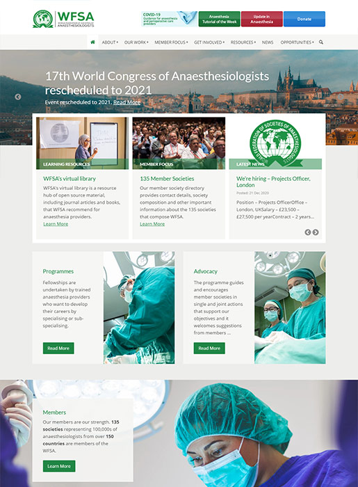
The World Federation of Societies of Anesthesiologists (WFSA) is a large international medical charity, with member societies from a 135 different countries.
Information Architecture
The website necessarily carries a vast amount of important information, so the central design challenge was to structure the content in a way that made it easy to find. This was achieved by offering the visitor multiple, logical navigation aids: clear indicators marking their place within the multi-level information hierarchy: a prominent 'breadcrumb' view, etc.
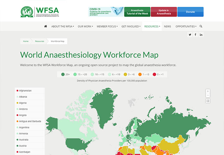
Interactive Workforce Map
Special features include the 'Workforce Map' where workforce data collected by the WFSA is displayed via an interactive world map showing the 'Density of Physician Anaesthesia Providers' for each country, plus other statistical details.
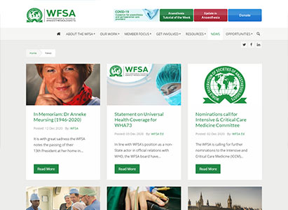
The website also includes a interactive 'Directory of Members', News, Events and 'Opportunities' listings.
Developed in partnership with Suspire Media
Citizens Advice Southwark
London Advice Charity
Website Design & Development :
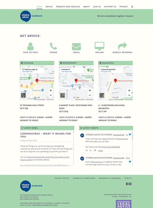
Citizens Advice Southwark (CAS), based in south London, offers free professional advice to all; via telephone, email and from its three offices in Peckham, Bermondsey and Walworth.
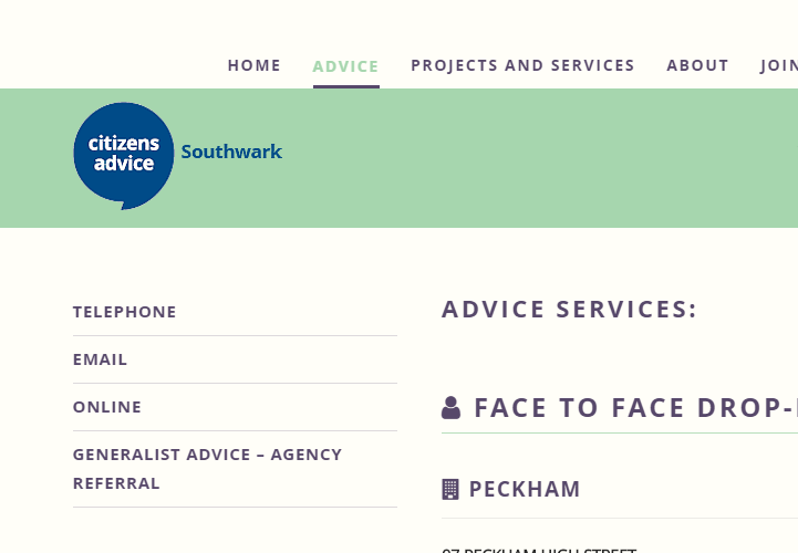
Target Audience
We produced a website for CAS that is fast, simple and clear. The website's visitors are immediately offered the four main means to access advice services, via large icons for Face-to Face, Email, Phone and Online. They're also presented with interactive maps to locate Southwark's three offices.
Online Enquiries
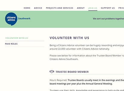
The site includes a clean, compact web form to allow people based in Southwark to make enquiries directly from the website. A 'Join Us' section offers the ability for visitors to view and apply for CAS's current vacancies, both paid and voluntary positions.
Citizens Advice Southwark have full control of the website, being able to add, edit and delete content via an easy to use Content Management System (CMS).
WCA
International Medical Charity Event
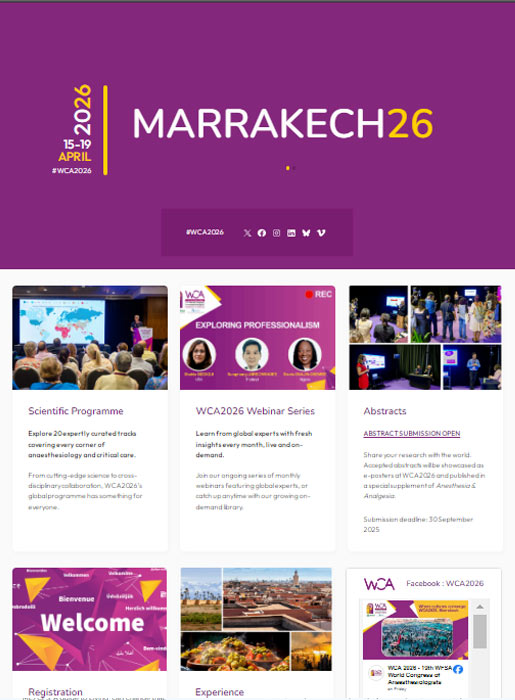
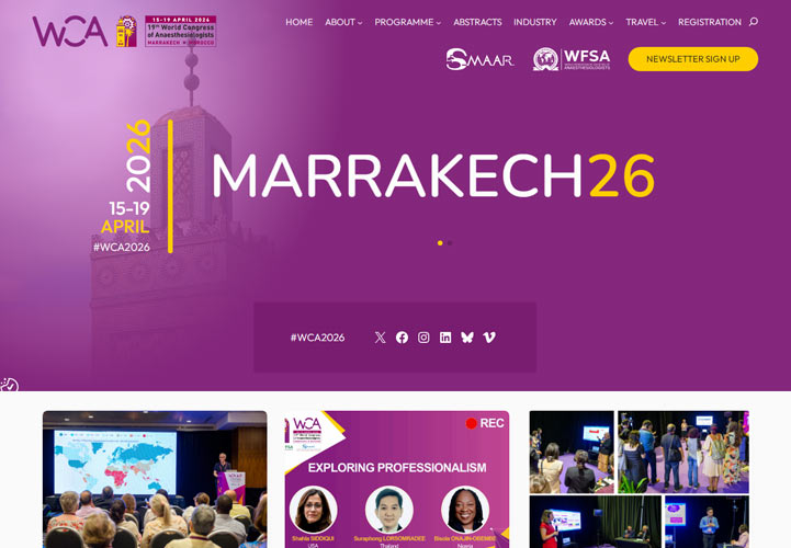
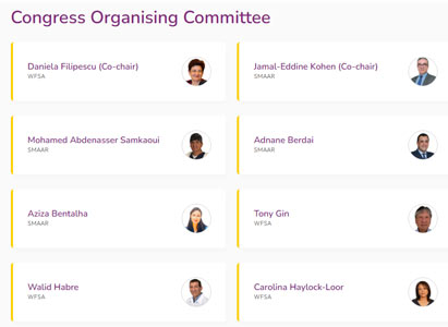
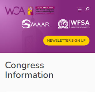
Website Design & Development :
The World Congress of Anaesthesiologists (WCA) is the preeminent global event for anaesthesiologists. Organised by the WFSA, we as the designers of their own main website, were invited to develop this major event website too.
Complexity Requires Versatility
As a large scale international event, this website includes a wide range of content 'types' : committees, programmes, submissions, partners, travel options, accommodation, registration . . .
Enter WordPress Patterns : These pre-defined block groups allowed us to design a series of specific, custom layouts for each content type, making it simple for the client to manage their complex content requirements.
Developed in partnership with Suspire Media
Severe ME
Health Charity
Website Design & Development :
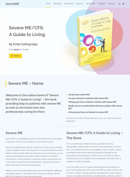
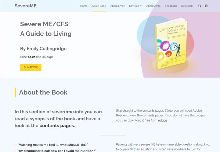
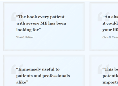
Severe ME is a website centred around a book written by M.E. sufferer Emily Collingridge, and sold by the charity Action for M.E. The book has become an important resource for those affected by M.E. and has recieved many positive reviews.
Complete Redesign
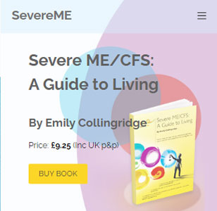
This is our third redesign for this website. When our client requested some major changes, we thought it important to 'reframe' the new content in a way that made it more accessible and offered a better user experience (UX).
Taking advantage of the latest coding techniques, we designed a wider, multi-column layout for display on large screens. As a text-heavy site, we also completely remodelled the typographic style. These changes make the site feel more spacious, inviting and easier to read.
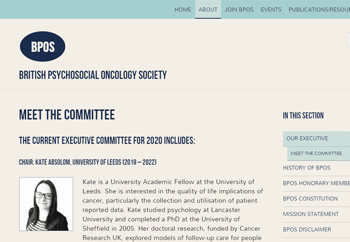
BPOS
Health Charity
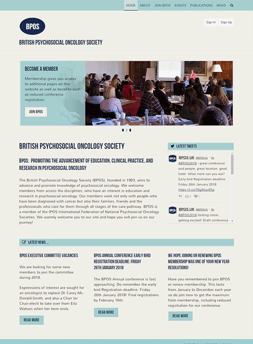
Website Design & Development :
The British Psychosocial Oncology Society (BPOS) asked for our help because they realised their old website wasn't helping them!
Much Needed Redesign
The old site was hard for visitors to use, it wasn't easy to modify or update, and the site wasn't being found because Search Engines like Google weren't listing it. With the new website we designed and developed for BPOS, all these issues have now been eradicated.
We re-mapped the information to follow a strong logical hierarchy, and produced a clear navigation system making it easy for site visitors to quickly find what they want.
Better Website Management
We chose an easy to use CMS platform with bespoke customisation, to make editing and updating the website simple. And as professional web designers we naturally employed search engine optimisation (SEO) methods to ensure the site is now easily found across all search engines.
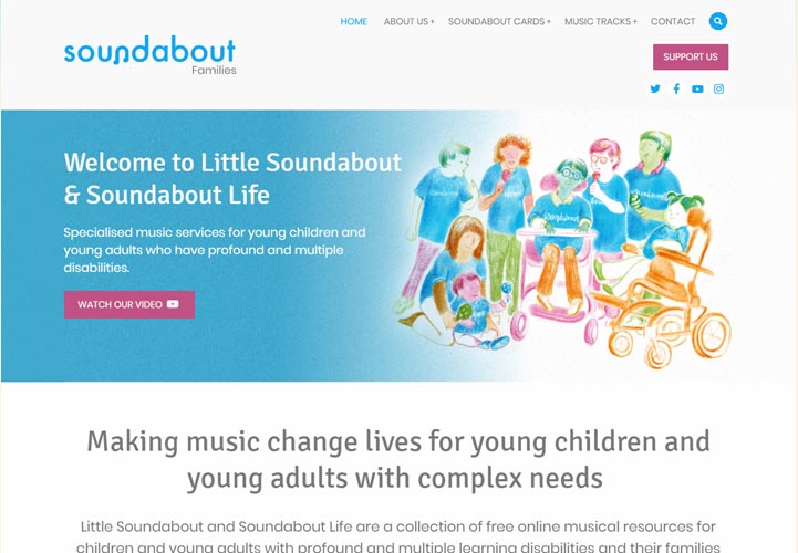
Soundabout Families
Education Charity
Website Design & Development :
Soundabout Families is a free online musical resource created by Soundabout
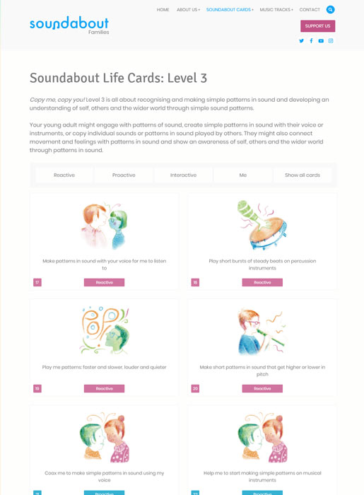
Music Therapy Activity Cards
The website is structured around 96 cards, each offering a unique music related activity. The individual card pages include a live-session video recording, with Soundabout's music therapy practitioners, demonstrating and expanding upon the card activities.
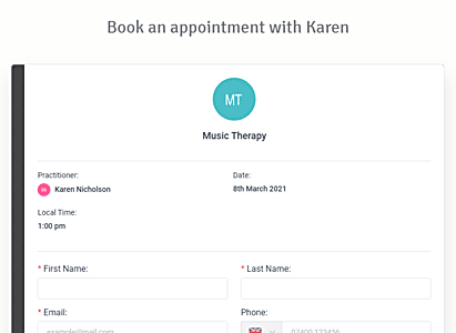
Music Therapy Appointment Booking
The website also allows the Soundabout Families to book a face-to-face music therapy session with one of Soundabout's registered music therapy practitioners. The site has over 30 practitioners so far, and each has their own profile page with a short bio, a photo and booking form.
Music therapy bookings, practitioner availability, cancelations, and registration are all managed via the website's content management system (CMS).
Developed in partnership with Suspire Media
Blossom Aethetics
Beauty Clinic
Website Design & Development :
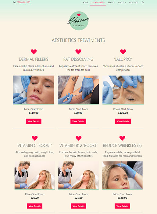
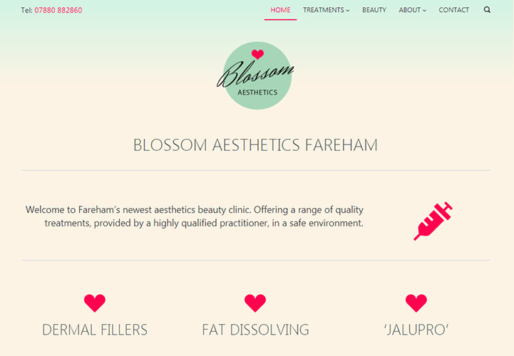
Blossom Aesthetics is a small beauty clinic based in Fareham.
Professional Help Needed
They initially used one of the many 'Build you own website - made easy' services, but soon realised the system was inflexible and wasn't capable of giving them what they really wanted.
They were also aware that they needed some professional input to help with the design.
Target Audience Research
The requirements brief was a simple brochure website, highlighting the clinic's services. Based on target audience research, we developed the website to appeal primarily to mobile (Smartphone) users. We arranged a professional photography session, so we could ensure a consistent look for all the key 'treatment' images on the website.
Overall the design is simple, 'spacious' and minimalist. And for those accessing the site via 3G/4G, the site is fast and responsive.