“Website typography is often neglected, but it Plays A Big Part In Determining whether people Will stay on your website or not”
The Web can carry a whole plethora of media – video, audio, interactive apps, social media – but ‘reading text’ is still by far, the dominant method for engagement and publishing information on the Web.
But what if your text is difficult to read, or simply just poorly designed and uninviting?
No matter how interesting or informative your web-based texts might be, if they’re difficult to read, then very few people will read them.
Most of us have experienced this with books – blocks of long, dense text, with tiny lettering – not an enjoyable reading experience. But this can be acceptable in a book, for example when a publisher is trying the make an important text more affordable by cramming it in to fewer pages. But these things should never be an issue on a website – where you have free, unlimited space? Yet it’s still common on websites – to find unappealing, hard to read texts.
Good Website Typography – Encourages Your Readers to Read More
If you use well designed typography on your website – if readers find reading easy, engaging, even enjoyable – then they’re far more likely to want to explore your website further, and to read more…
Web Typography Basics – Readability, Legibility
Long Line Length – Still by far the most common typographic error we see on websites. And yes, it’s a personal peeve!
Line length is the number of words found in a line before dropping down to a new line. If the line is overly long, the eye struggles to scan to the next line easily, making reading difficult. You’ll never see long line lengths in professional print media – they’ve been aware of this for centuries.
However, long line lengths are still too common on websites. Maybe that’s because professional web designers are not so easy to find?
Preventing long line lengths is technically really easy to implement on a website, so we can only presume many designers just aren’t aware of this typographic fundamental?
Text Size – Make sure text-size is generously large, so that even people with poor eyesight can still comfortably read.
It’s easy to change the size of text on a website, and you’re not constrained by space (infinite scroll), so make text as big as you reasonably can.
Contrast – Ensure there’s adequate contrast between your text and the base it is written on – foreground and background contrast. Reading low contrast text is difficult, and over an extended period, becomes tiring and causes eye strain.

Avoid extreme contrasts too – black on white/white on black for example.
There are plenty of tools online and included with Browser software, that can help ensure contrast ratios are acceptable.
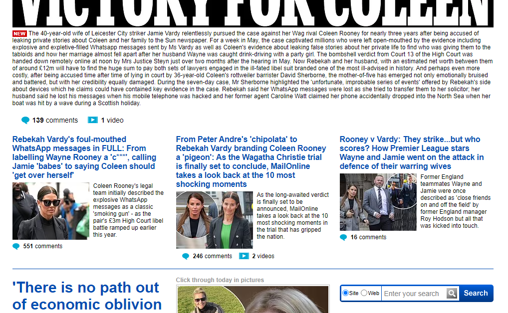
Typefaces (fonts) – The typeface you choose can also help with legibility. Typeface options for Web use have expanded massively in recent years, so there’re plenty to choose from. Remember you’re designing for ‘screens’ not paper (print), and some typefaces that work well in one medium, may not work so well on the other. Do some basic research to find typefaces that are recommended for legibility on screens.
Mix typefaces to differentiate between your textual elements – headlines, sub-headlines, quotes, paragraphs, side notes, etc. This can improve readability in creating a well-defined, easy to follow, structure to your text-based content. Some typefaces are designed specifically for these narrow use cases.
Colour – Colour choices and combinations can both help and hinder readability. As with typeface choices, colour can be used to enhance the structure of your content, but certain colour combinations can make reading ‘painful’.

It’s OK to make a big splash here and there, but with the main body of your content, it’s better to play safe.
The Art of Typography – Attractive and Engaging
Once you’ve ensured your website’s texts are easy to read, you might want to consider how you can use typography to make your website more appealing and engaging.
As technologies have advanced, over several centuries, print-based typographic artists have created all kinds of beautiful and intriguing designs with type. Over the last 25 years, Web-based typography has developed too – but it still has some way to go before catching-up with print.

Remember also, that unlike print, the Web is not a static medium. There are a whole range of different sized devices that can access the Web, different Platforms and different Browsers – so text on the Web needs to adapt and respond to all these differing scenarios. However, despite some limitations, there are ways to make you website’s typography more characterful and inviting.
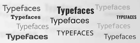
Density – Controlling the spacing of your text offers a way to adjust the overall ‘aesthetic’ of a page (web view).
Changing the letter-spacing, word-spacing and line-height will have a dramatic affect on how text looks and ‘feels’.
Typefaces – Choosing more stylised or ‘artistic’ typefaces can offer some interesting creative options, and can be used to help your website’s design stand out.
However, you need to be careful in making sure typefaces compliment your overall ‘tone’, and are appropriate to your subject matter, etc.
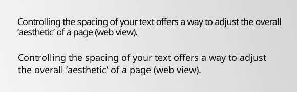
Typographic Flair & Flourishes – Web technologies continue to evolve, offering additional creative possibilities for your typographic design.
It’s possible now to add a stroke or border to your type. Drop-shadows, gradients, and background textures can also be ‘carefully’ added. Opacity levels can be adjusted, and very recently, blend modes and basic filtering have become available.
You can change the orientation of text too – perhaps a word or two of vertical text can add a bit of drama to your design?
Lastly, there’s animation. A subtle animated colour-shift on a line of text will certainly draw the eye.
Give Your Website’s Readers What They Deserve – Good Typography
Simply put – well designed, properly structured typography on your website – will give your readers a much better reading experience. If your texts are free from the typographic issues that distract and irritate readers, then they’ll be more likely to want to continue reading.
If you need a way of adding some unique styling, a bit of flavour, or a touch of creative flair, typography also offers great ways to help you with that too.