“Don’t frustrate your Website’s Visitors: How to make it easy for people to find what they want on your website”
‘Website Navigation’ is a term used to encompass the simple idea of how visitors are able to find the things they are looking for on your website. In the context of ‘professional’ web design, it’s about how to make this task as easy as possible for those using your website. The User Experience (UX).
Structured Content – ‘Information Architecture’
The starting point in making sure your website is easy to navigate, is done in the ‘website planning‘ phase.
You need to consider what information/content will be included on your website, and how that can be structured in a logical way. How the information should be classified and categorised, so that every website visitor can easily identify where the information they want is most likely to be found. If you have a large website with many pages, you need to also consider how content might be ordered hierarchically.
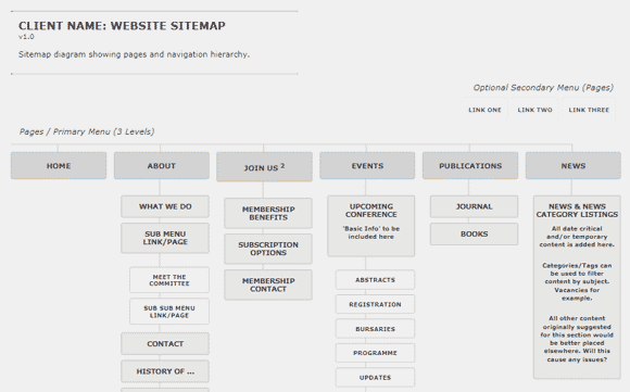
Sitemap and Navigation ‘Menus’
When you’ve decided how your website’s content should be structured, it’s a good idea to create a graphical representation of this with a website ‘sitemap’. Remember, the content structure needs to be flexible and ‘future proof’, as you may want to expand what your website offers visitors, at a later date. Try using ‘pyramid’ structures, with more general (encompassing) subjects at the top, expanding to specific subjects at the bottom.
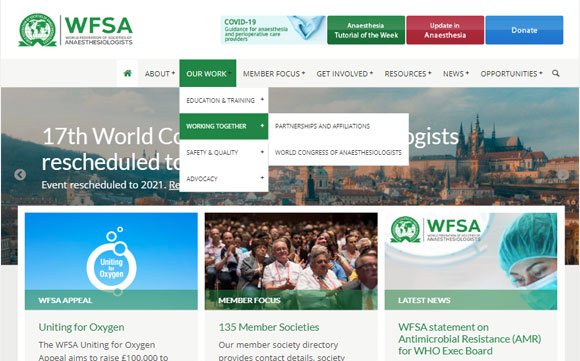
Website Menu Design : Primary Menu
Once happy with your content structure, you can use it to form your website’s primary navigation menu. The primary menu will be what most people use to navigate their way around your website, so it needs to be well designed.
Follow Conventions
Follow conventions as to where you place your menu in the overall design – usually close to the top, horizontal orientation. Limit the number of options available on the top-level of your menu: no more than seven or eight items, and keep the menu text labels short. This will help ensure the menu remains well-defined on a single row (no wrapping) on all screen sizes.
Use Cues and Feedback
Use design ‘cues’ to make your menu clear and obvious to the user: generous spacing, containing borders, colour, typographic styling, etc.
Offer feedback to your visitors by having your menu indicate which ‘page’ is currently being viewed. If for example, the user is on the site’s ‘Home’ page, the menu’s ‘Home’ item could reflect that by being a different colour.
Many hierarchical websites use ‘Drop-Down’ menus that reveal sub-pages on ‘hover’ (mouse-over). You need to make sure these menus work on all devices, including ‘touch’ based devices. Many websites using drop-down menus don’t work correctly on Smartphones and Tablets.
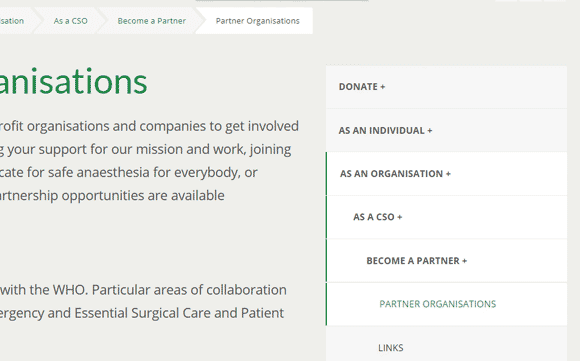
Custom and Secondary Navigation Menus
It’s often a good idea to offer additional menus for your website visitors. An example would be to have a custom ‘Highlighting’ menu – perhaps in the footer of your website – that groups a set of pages that you consider to be important.
A secondary menu can help to ‘declutter’ your primary menu. You could remove all your ‘small print’ and ‘legal’ pages from the primary menu – Privacy Notice, Cookie Policy, Data Protection, Terms of Use – and place them in a separate menu of their own.
‘Home’ Page as ‘Front Cover’
Where possible, use your website’s ‘Home’ page like a magazine would use its front cover. Use your home page to highlight the interesting and important content your website contains.

Whilst browsing your website, people will often return multiple times to your home page, seeing it as the starting point for other interesting content they may wish to view.
Make sure navigating to your home page is made easy. Perhaps differentiate the item in your primary menu. A common convention is to have your ‘logo’ linked to your home page, as an additional means to return there.
If you have something you wish people to do when they come to your website – make a purchase, make a donation, fill-in a form – help visitors to navigate by creating prominent ‘calls to action’ (CTAs) on your home page.
News, Blog or Articles – Social Media Too
If you have any serialised content on your website, such as news or a blog, help visitors find them by ‘feeding’ your latest two or three posts through to your home page. Do the same if you’re using social media channels – feed your latest YouTube video or Tweet to your homepage.
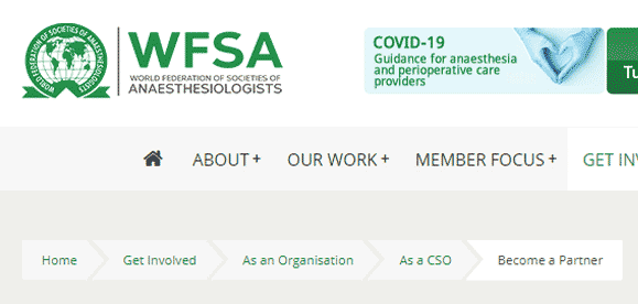
Breadcrumb Trail
If you have a large informational website, with a multi-level hierarchical structure, another navigational aid worth considering is a ‘breadcrumb trail’.
Breadcrumb trails are a way of exposing the hierarchical structure on your website, allowing visitors to see clearly where they are, whilst additionally allowing them to easily move-up levels of the hierarchy (parent levels).
Context Based Navigation
An important, but often underused navigation technique, is adding contextual navigation links within your content. If for example, in our writing we use a term or phrase that is expanded upon elsewhere on our website – say ‘website usability‘ – then we link the term to that place.
Common Error – Avoid Using ‘Click Here’
When using context based links, don’t just write ‘click here’. Make the text that is linked meaningful. This will not only help with navigation, but also improves Search Engine Optimisation.